
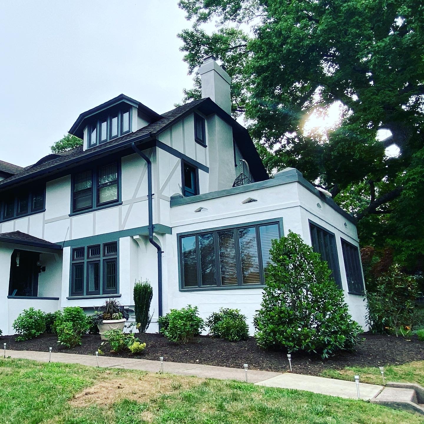
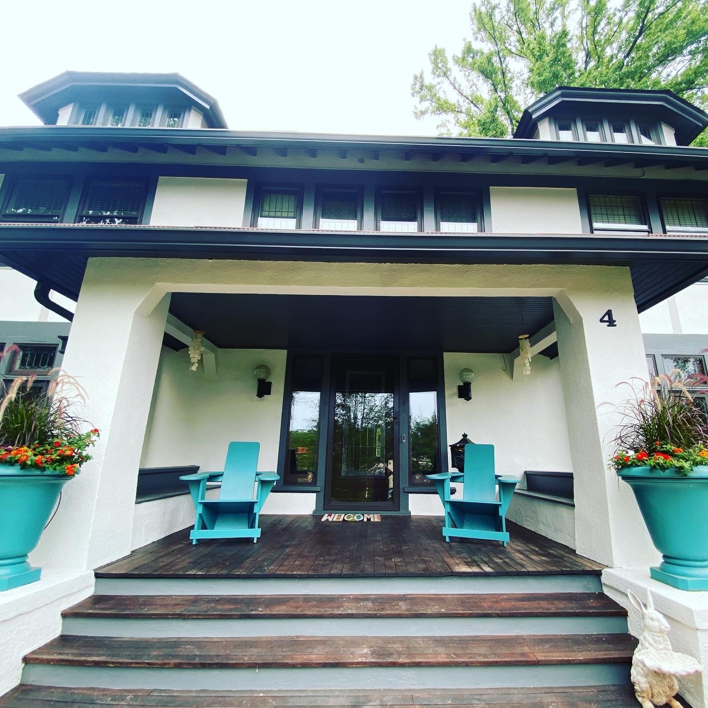
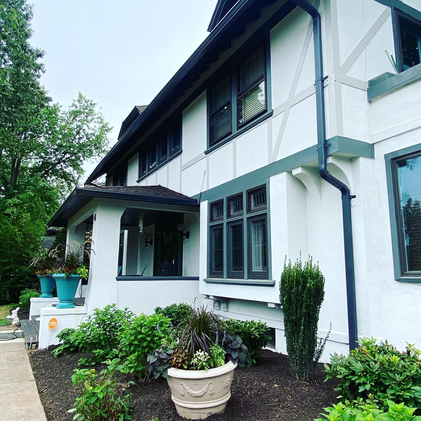
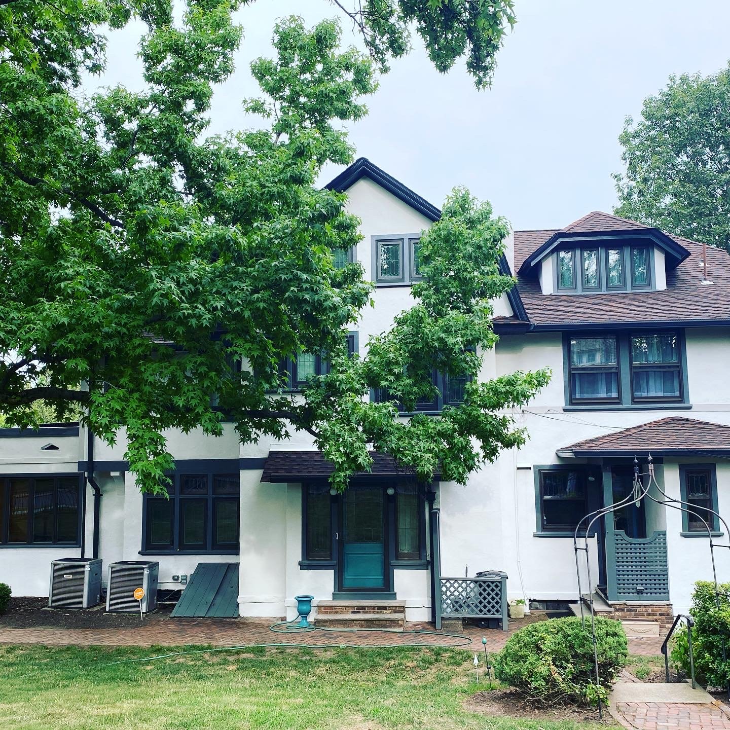
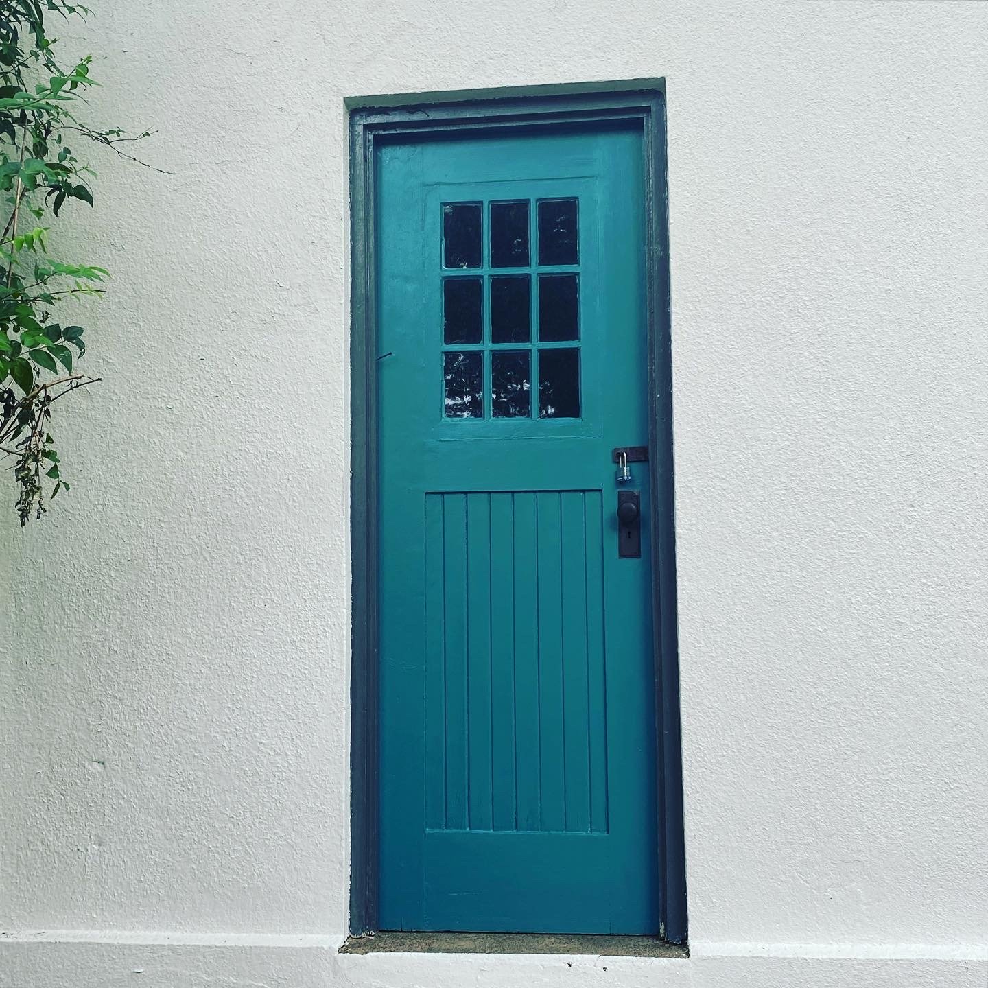
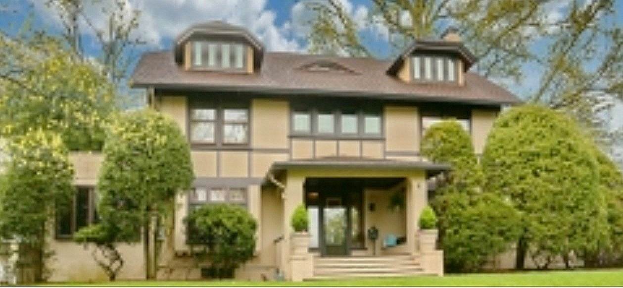


















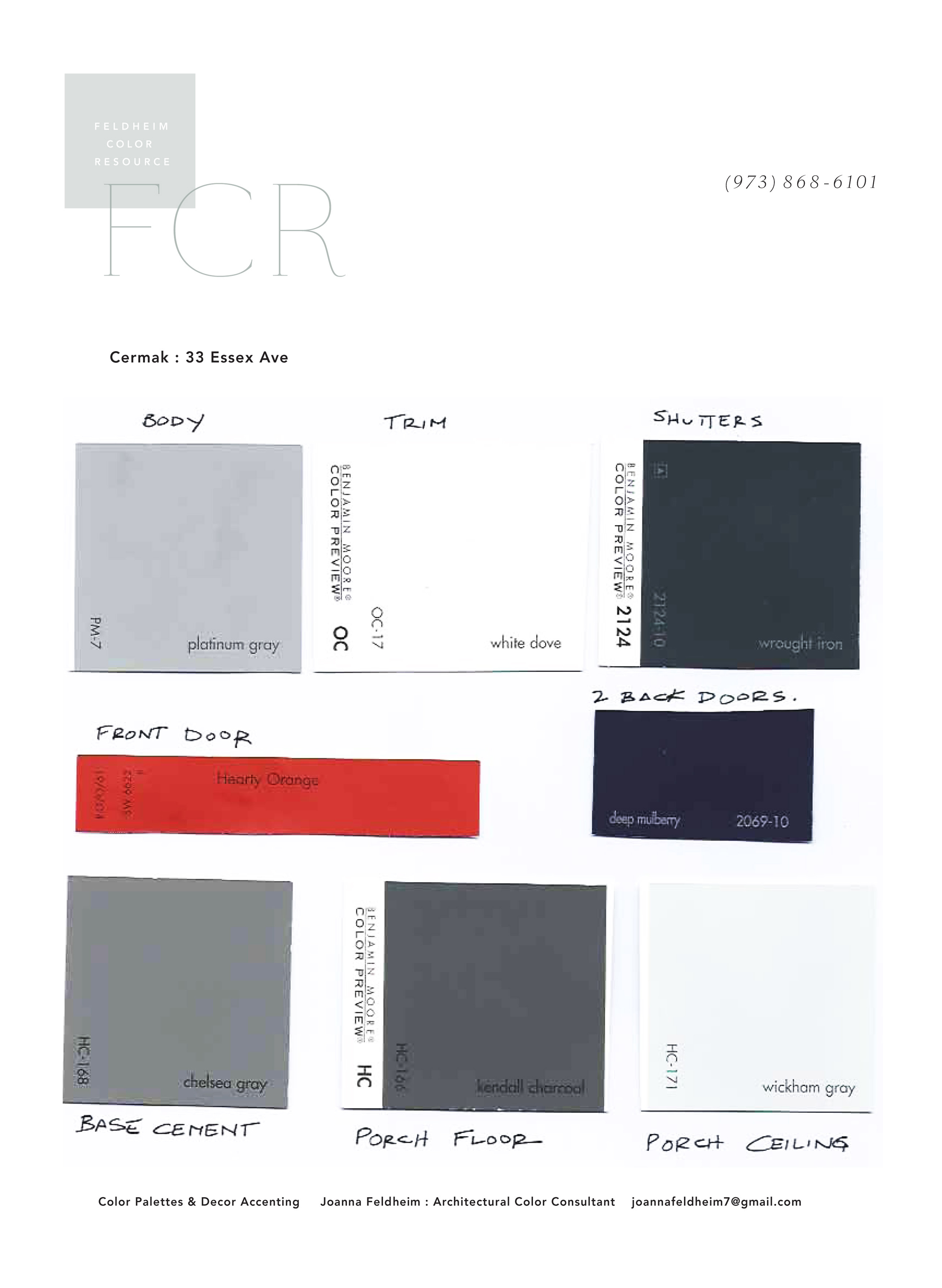








Project: Exterior color palette for a Tudor style home designed by Dudley Strickland Van Antwerp, Montclair N.J. I recommended they forego the traditional beige/brown tones and highlight this homes wide prairie architecture. They also requested a bright accent color that aligned with their Latin American heritage.

BEFORE.
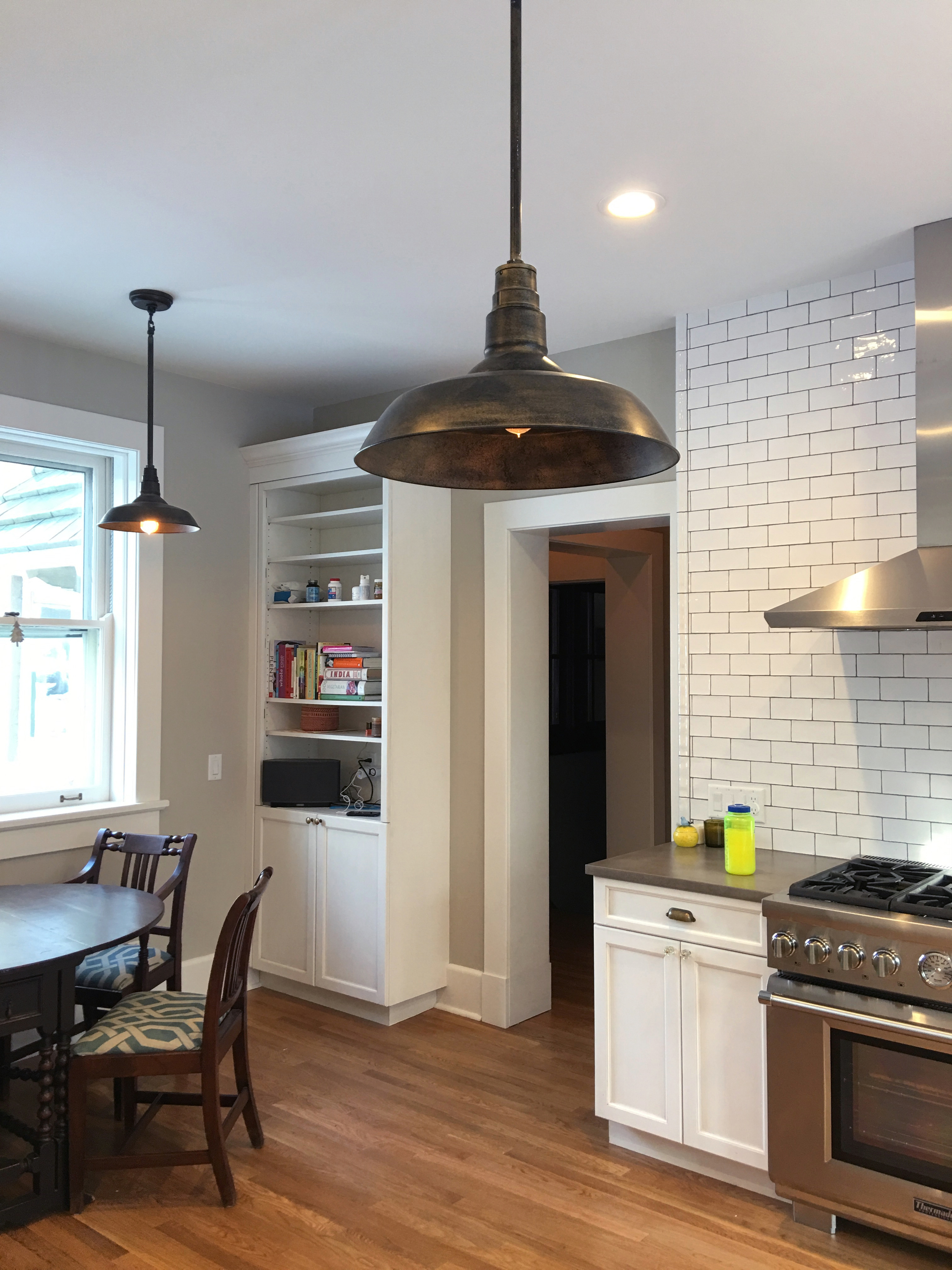
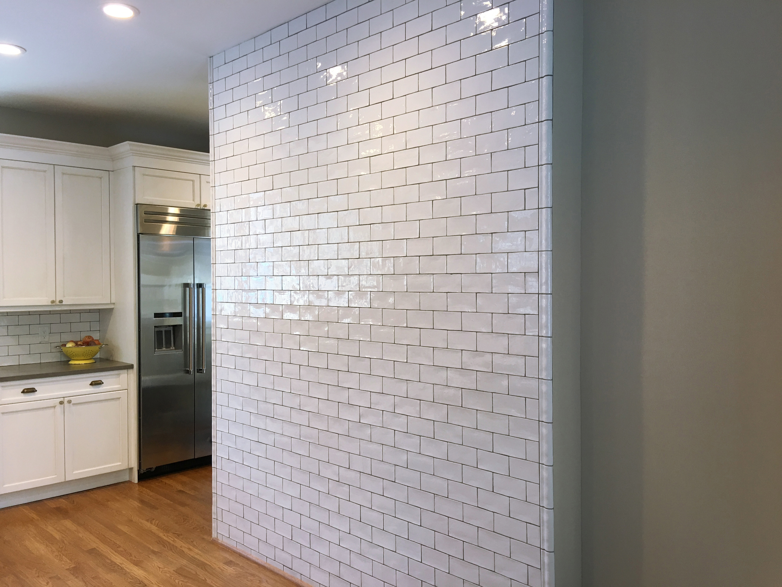
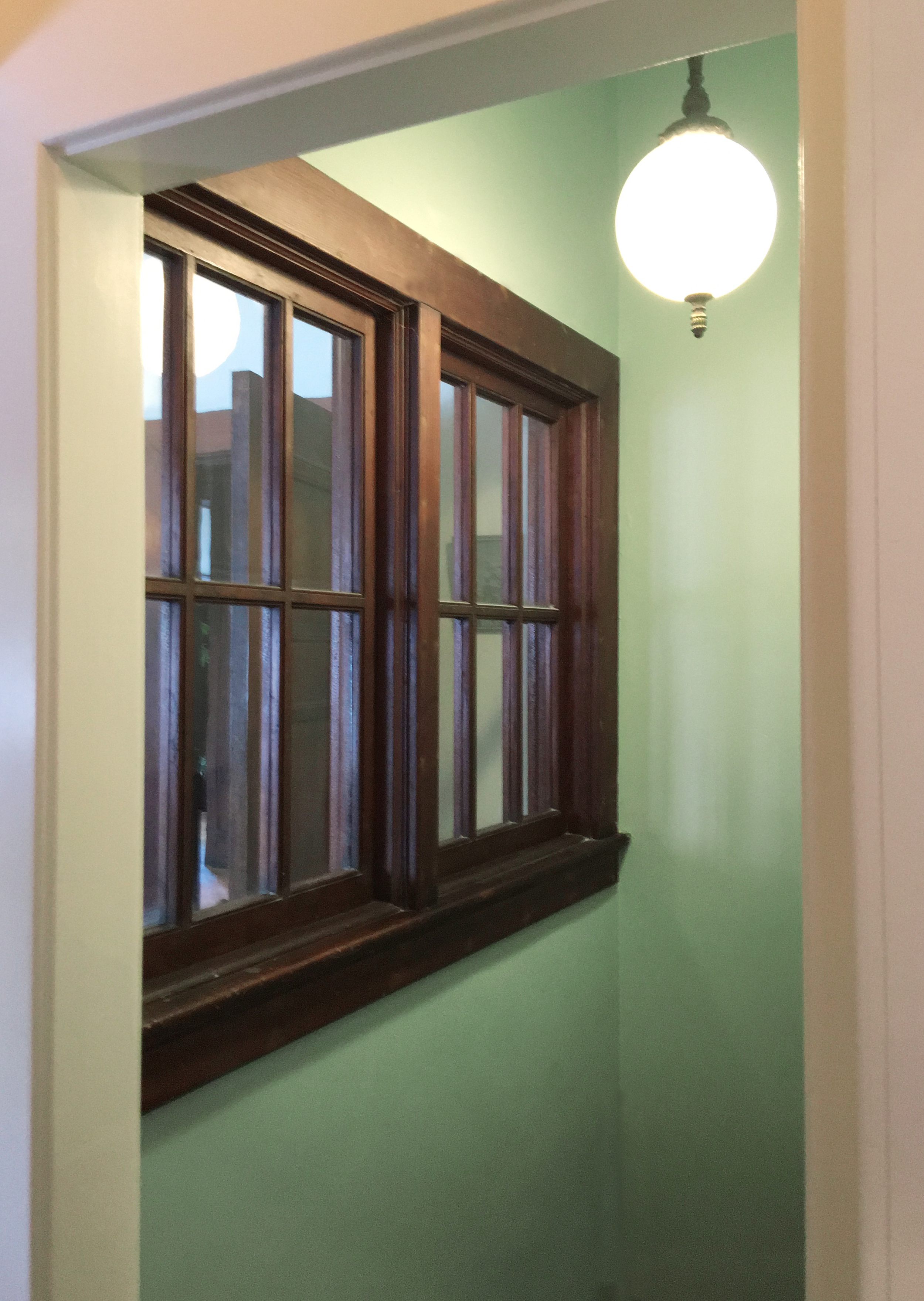
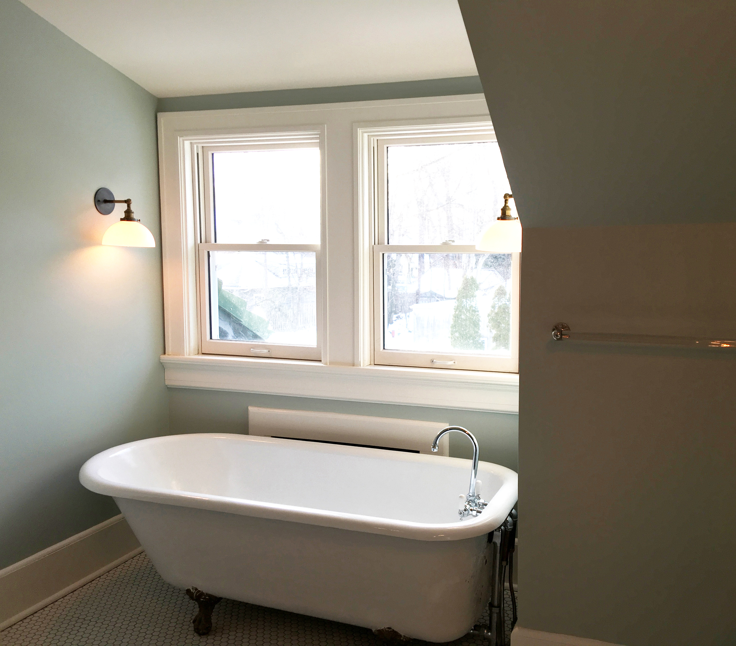
PROJECT: Interior color and decor recommendations for a farmhouse kitchen, bathroom and hallway. Italianate style home in Montclair, N.J.

AFTER: Architectural color and decor for renovation in 1904 estate: kitchen, mudroom, butler's pantry, basement, third floor bathroom. Homeowners consulted me for plan review, materials and decor accenting.

Homeowners made smart choices such as re-defining the original kitchen sink into a flower sink in the butler's pantry.

BEFORE: Beautiful 1880's Victorian lacking contrast. Saw potential in defining body, roof, shutter and accents to define architecture more with both value and tone. Client requested a blue house.

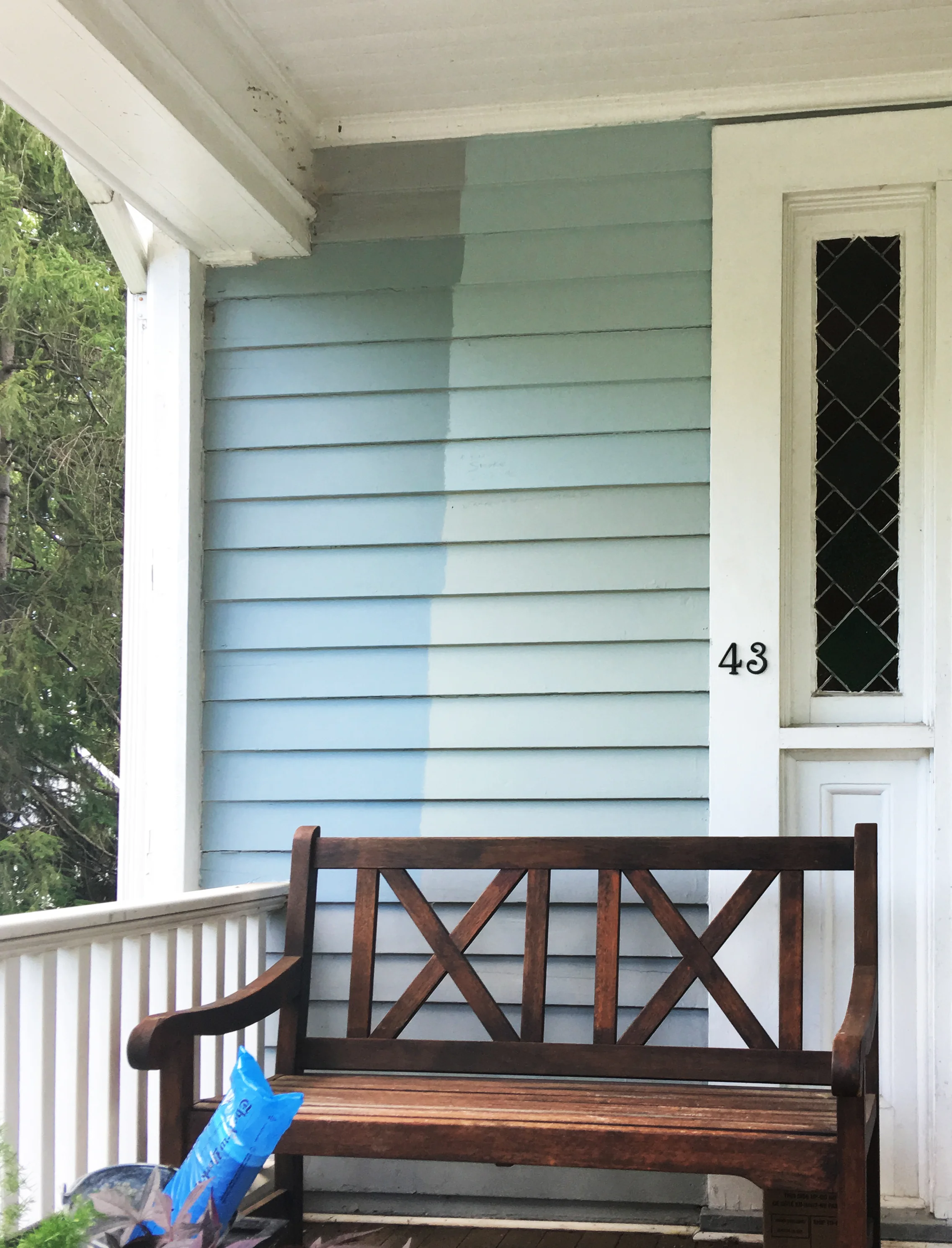
While the roof and woodwork were renovated, we tested various options for the body from subtle to rich.

AFTER: The client chose Benjamin Moore Nimbus Gray accented with crisp white trim and accented with dark tones from Farrow and Ball.

New house color detailing is a backdrop to the rich architecture with grace and ease. Paint color is a supportive backdrop to enhance— not compete with— architecture.

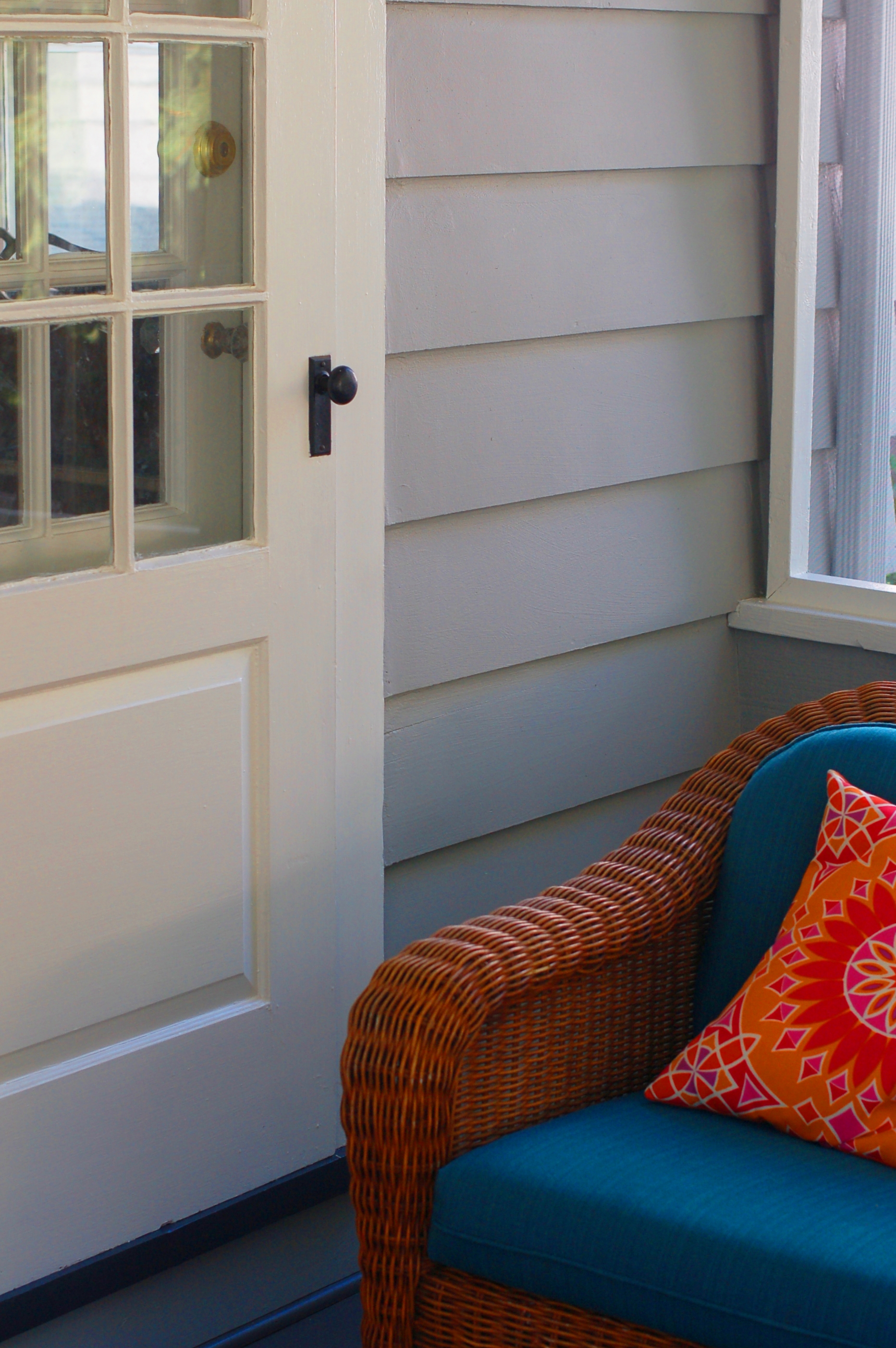
Porch Detail: Dark Wood Stain specified for old porch floor and contrasting trim with subtle porch ceiling gray tone to enrich the feeling of space and protection.

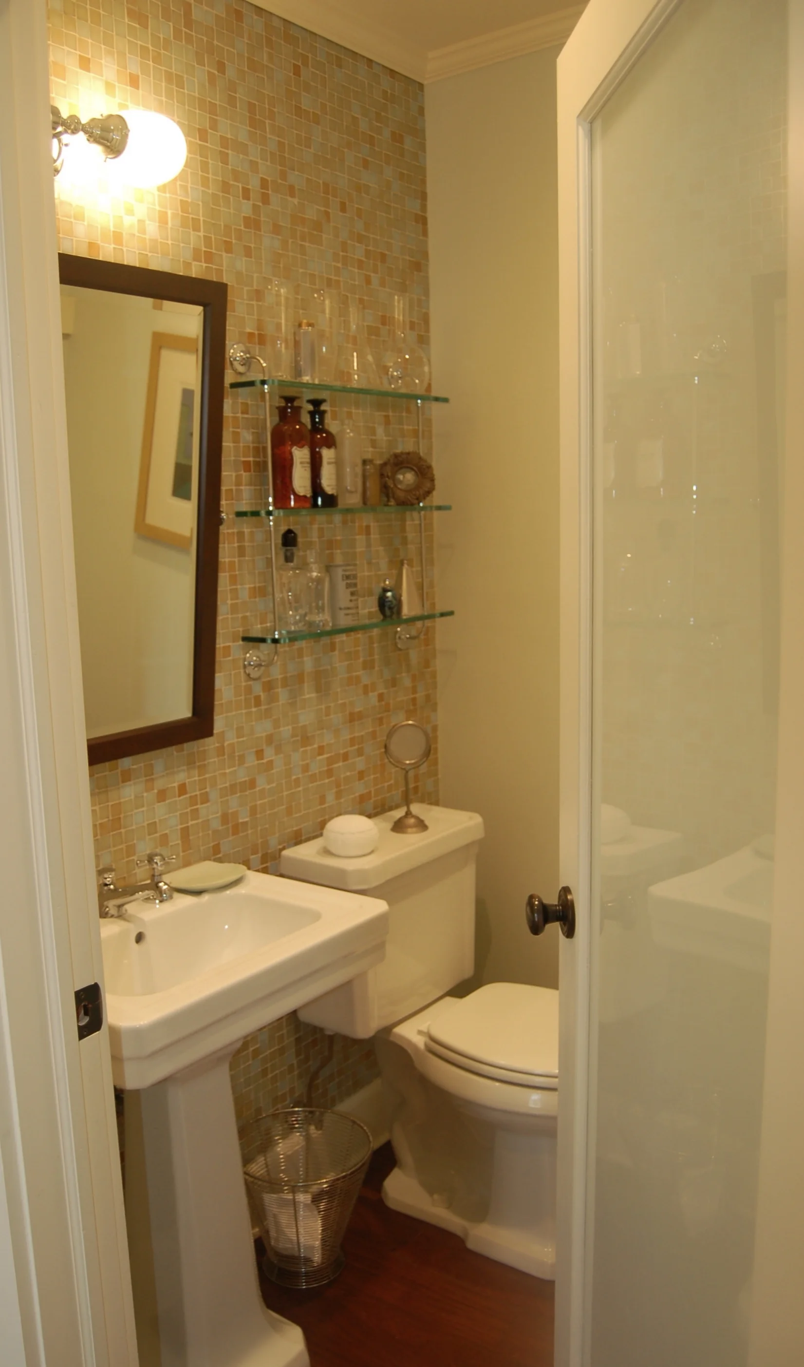
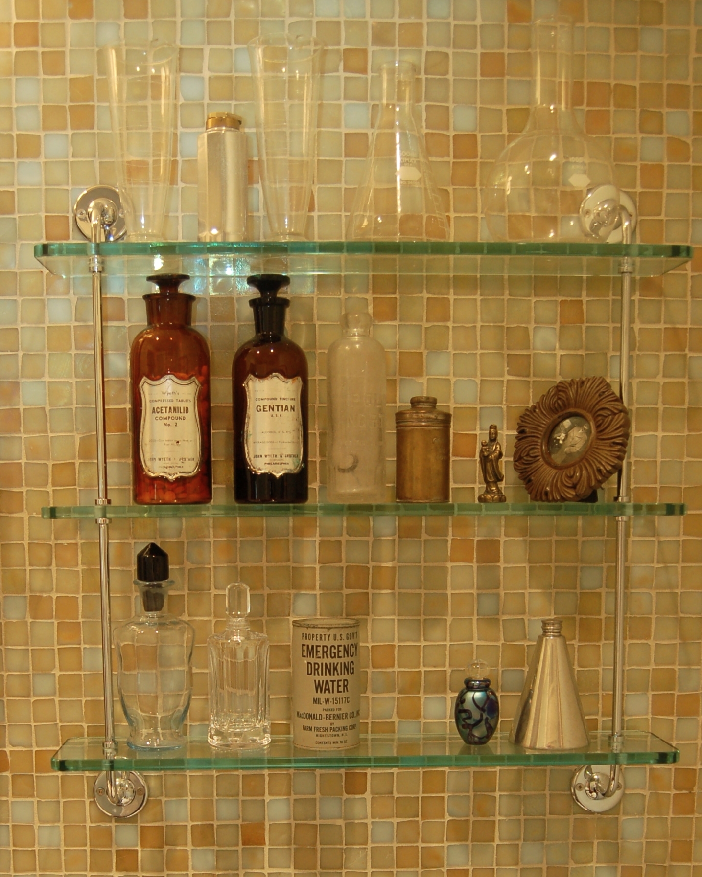
A 1920's side hall colonial renovation including kitchen, powder room, dining room, den and porch with eyebrow roof construction. Concept created and managed by Joanna Feldheim based on floor to ceiling cabinetry from the 1920's general stores. Architect: Rosette Komenian of RDK Architects. Construction: Stoddardt Associates

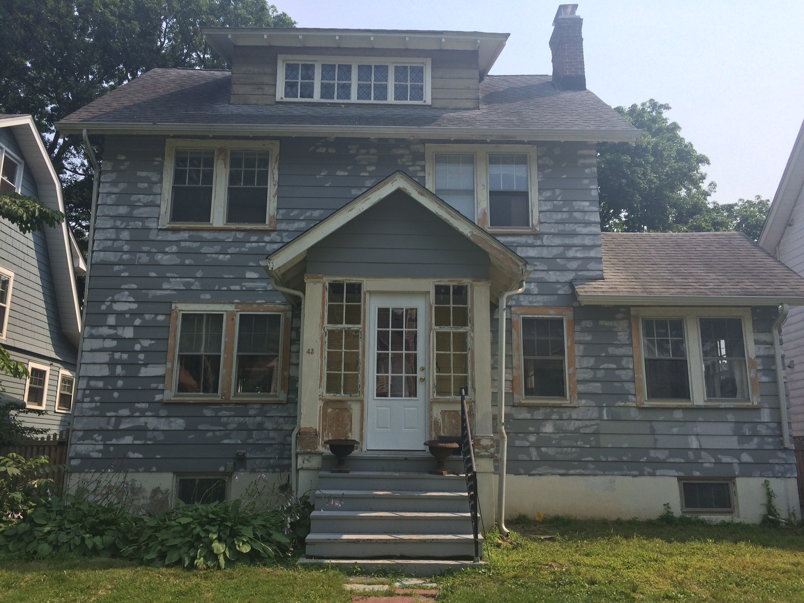
After shot : A light neutral warm grey with black accenting and aqua highlights. Ready to complete walkways and plantings.

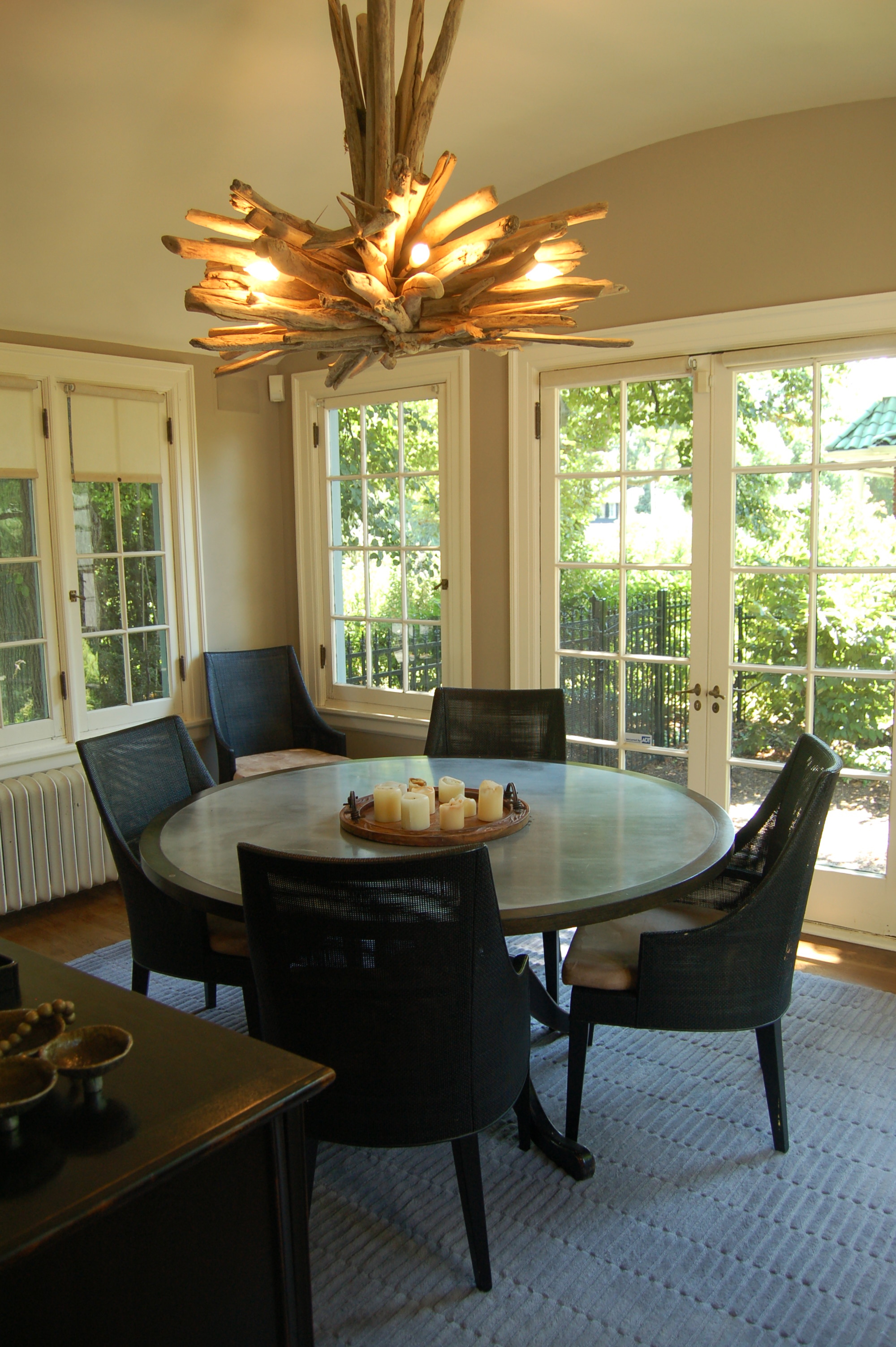
A gem of a house that was built as a wedding present. Owners decided to move their dining room into the side porch and use the dining room as a den adjacent to the kitchen for modern living. I presented neutral Farrow and Ball tones to compliment the primary tones of the decor throughout the ground floor. The curved ceiling in the dining room was painted with a high gloss finish to contrast the rustic wooden fixture.

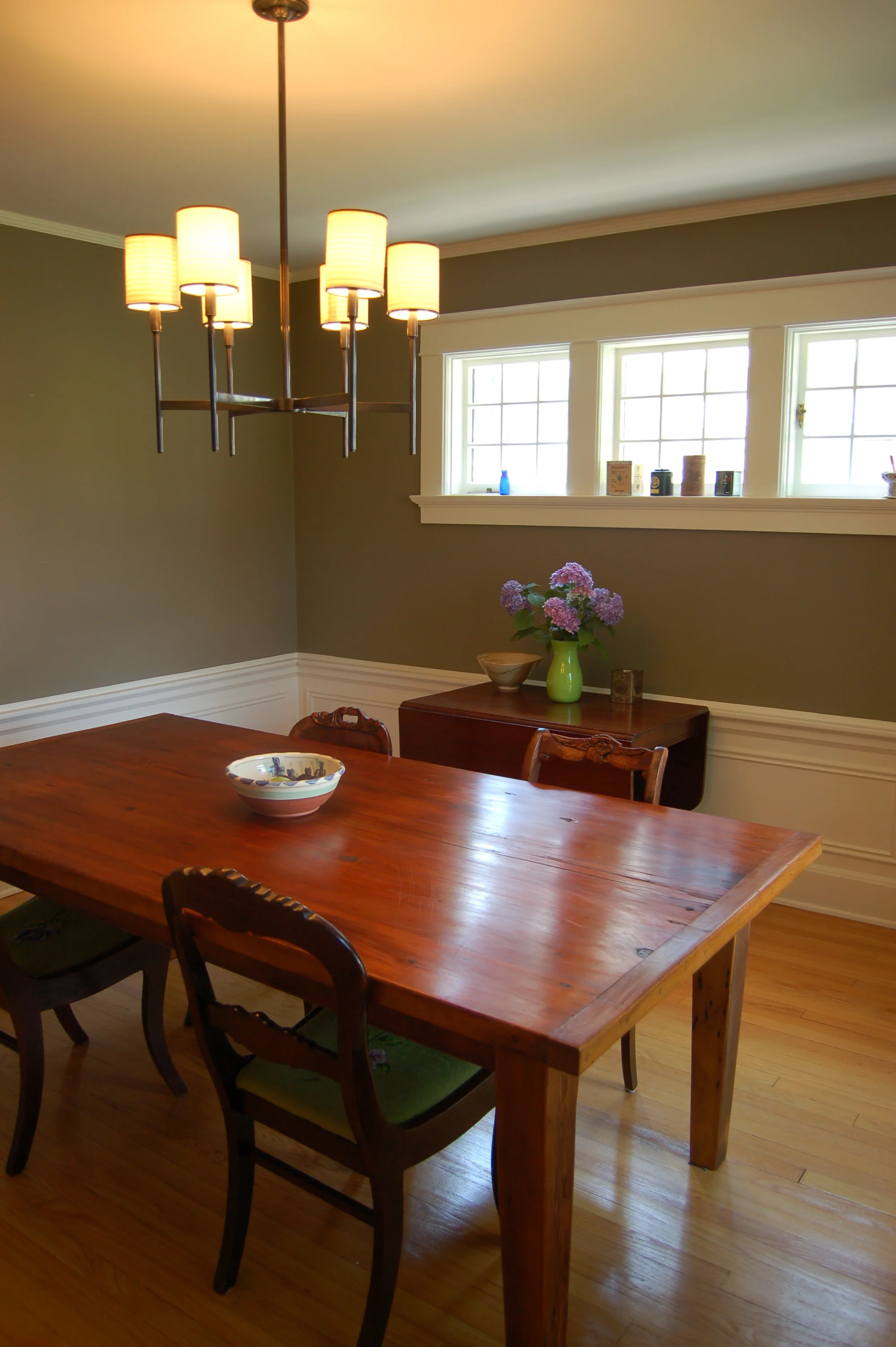
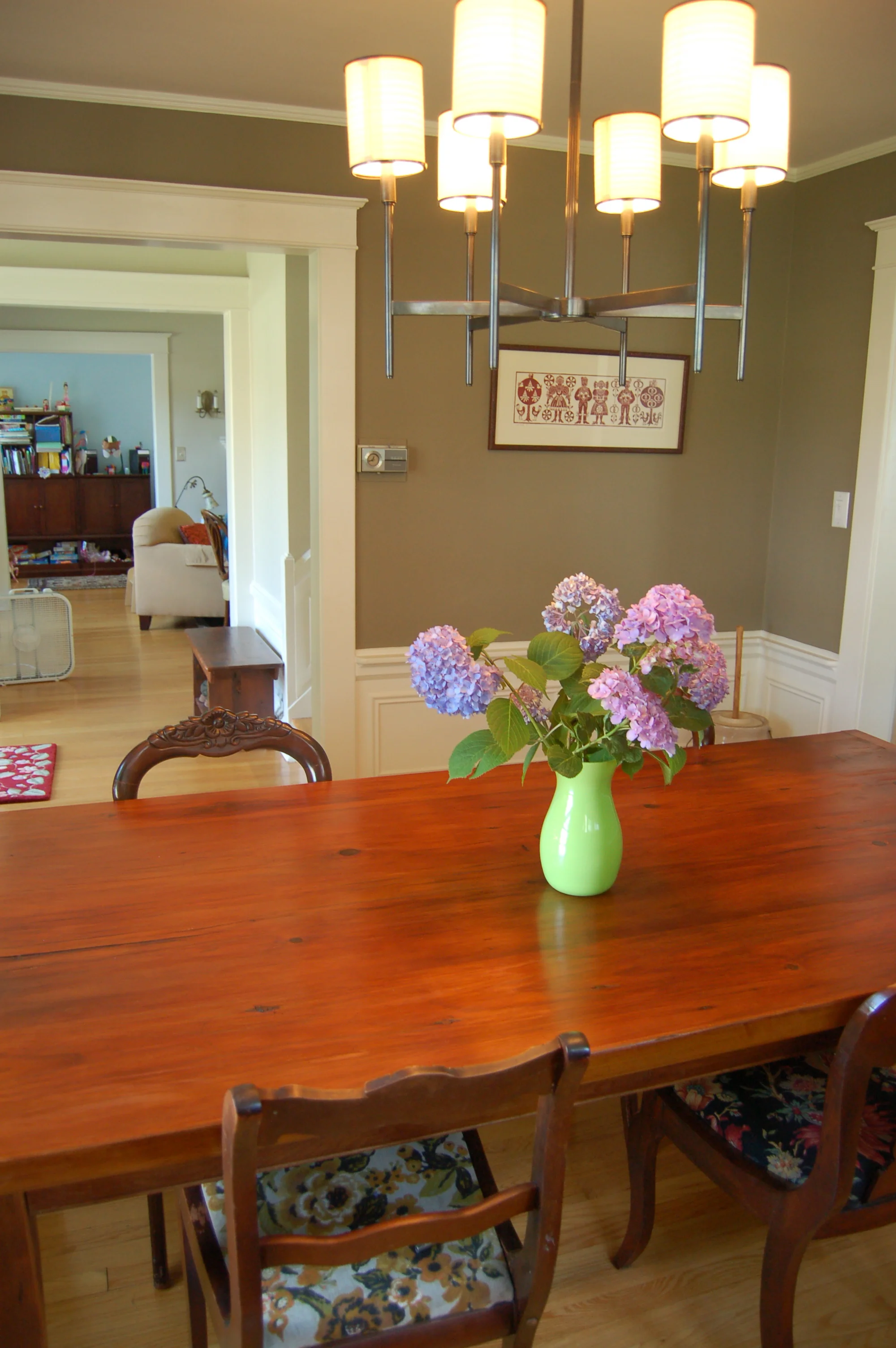
Farrow and Ball "Mouse's Back" recommended for this dining room to compliment the progressively cooler tones chosen for the adjacent rooms.

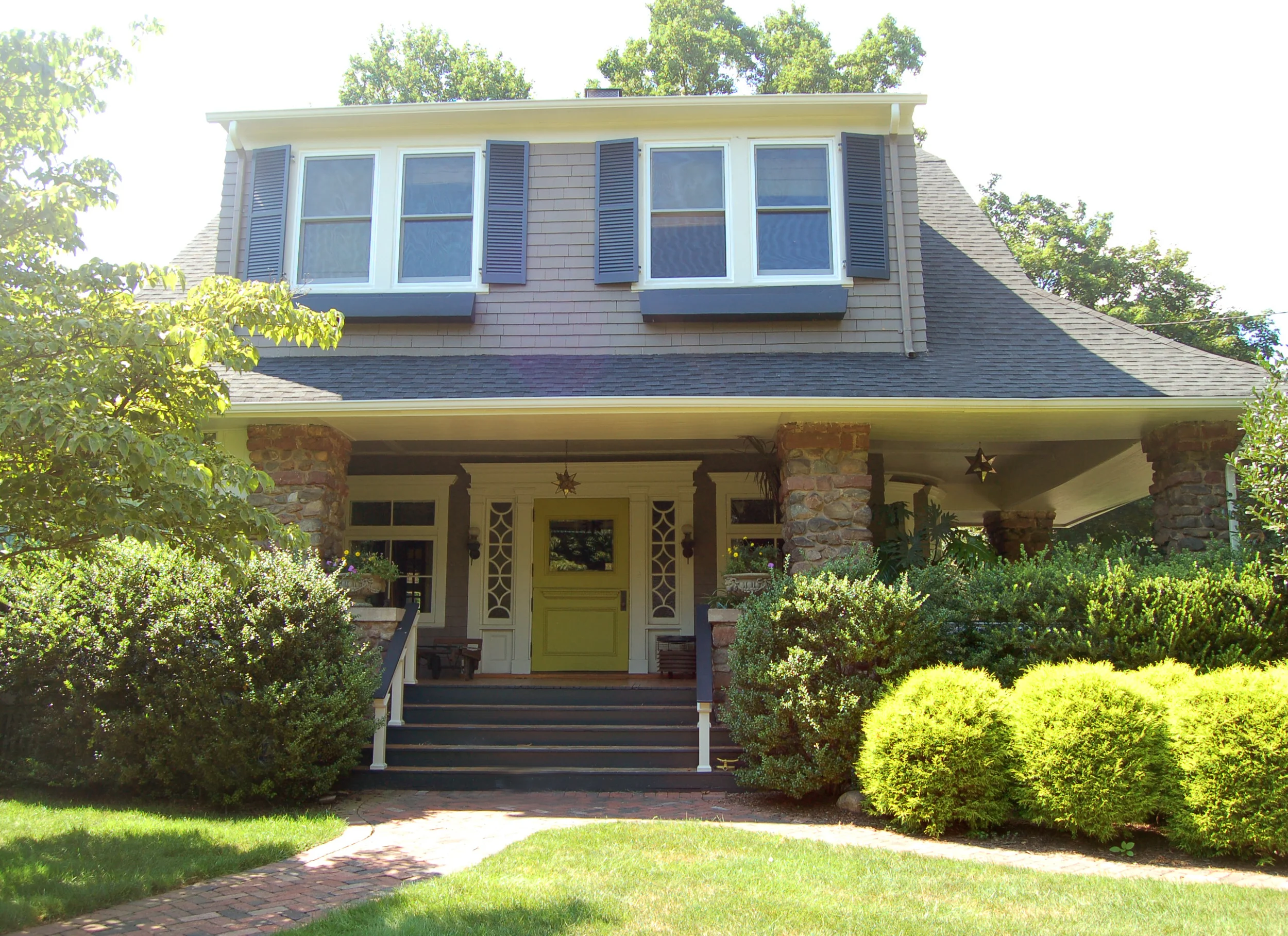
Client requested a neutral dark tone for the body of this Art and Crafts home with lots of stone. The chartreuse front main door complimented the flowering hydrangea trees and the foot of the entranceway.

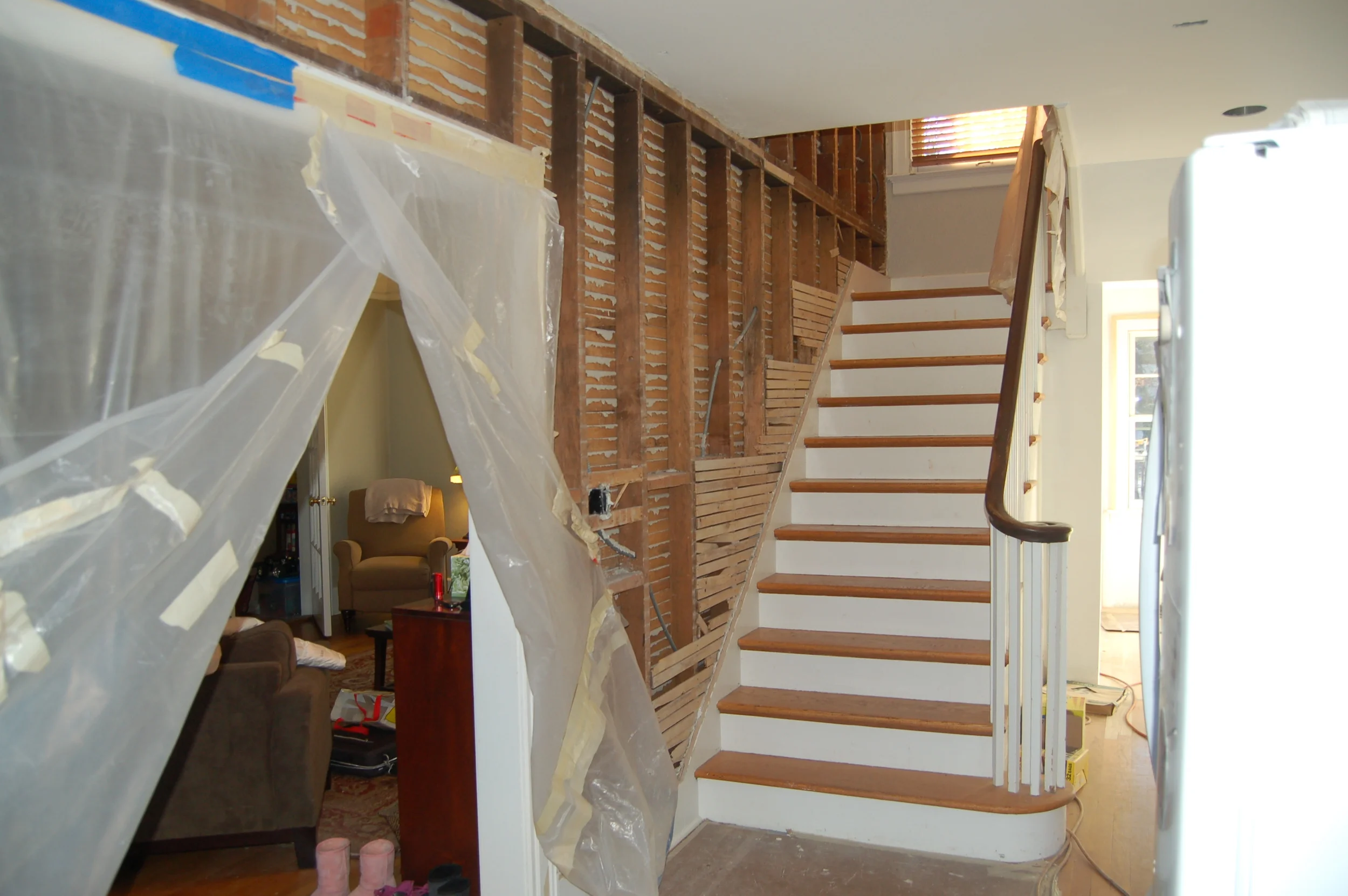
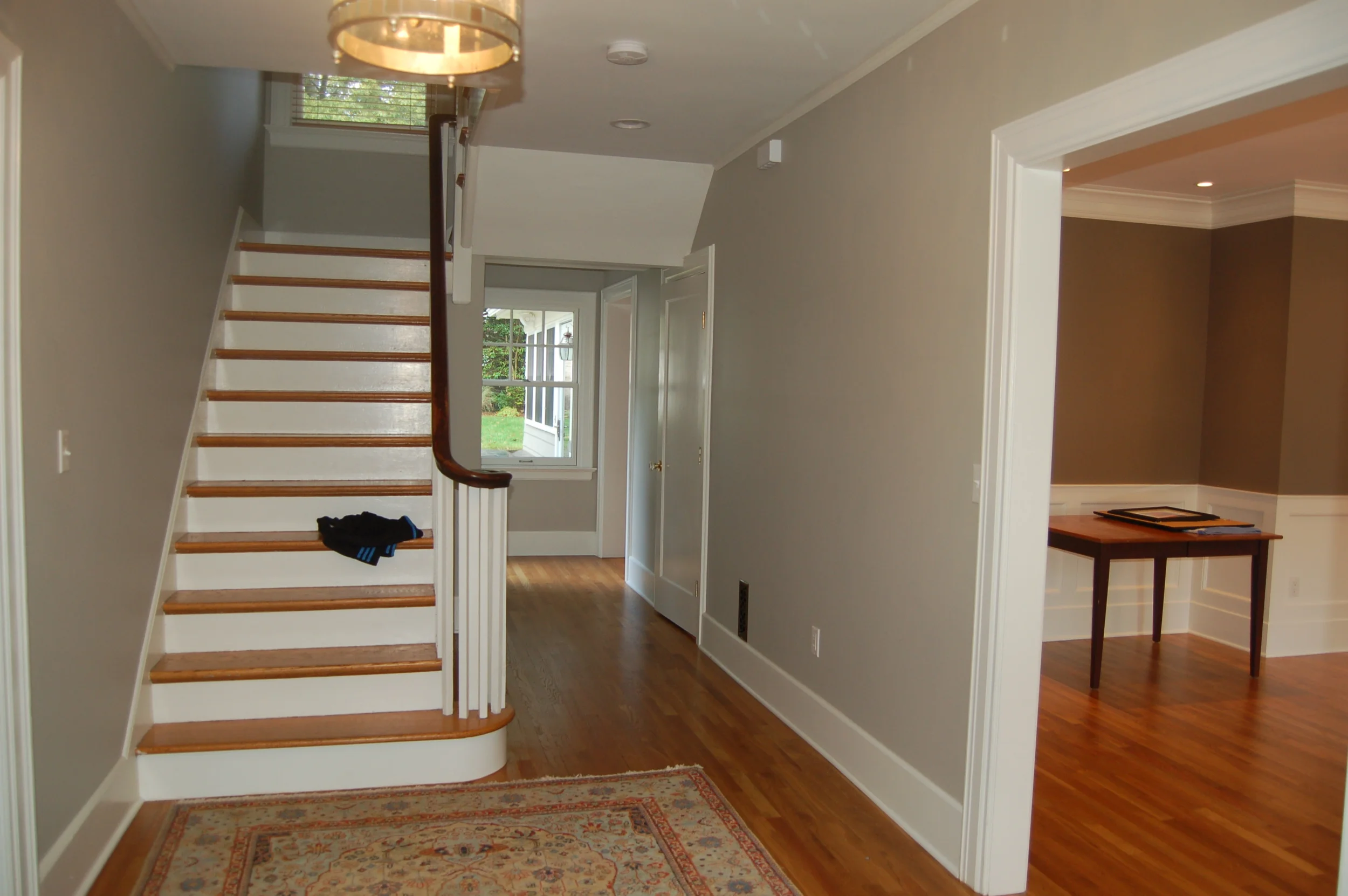
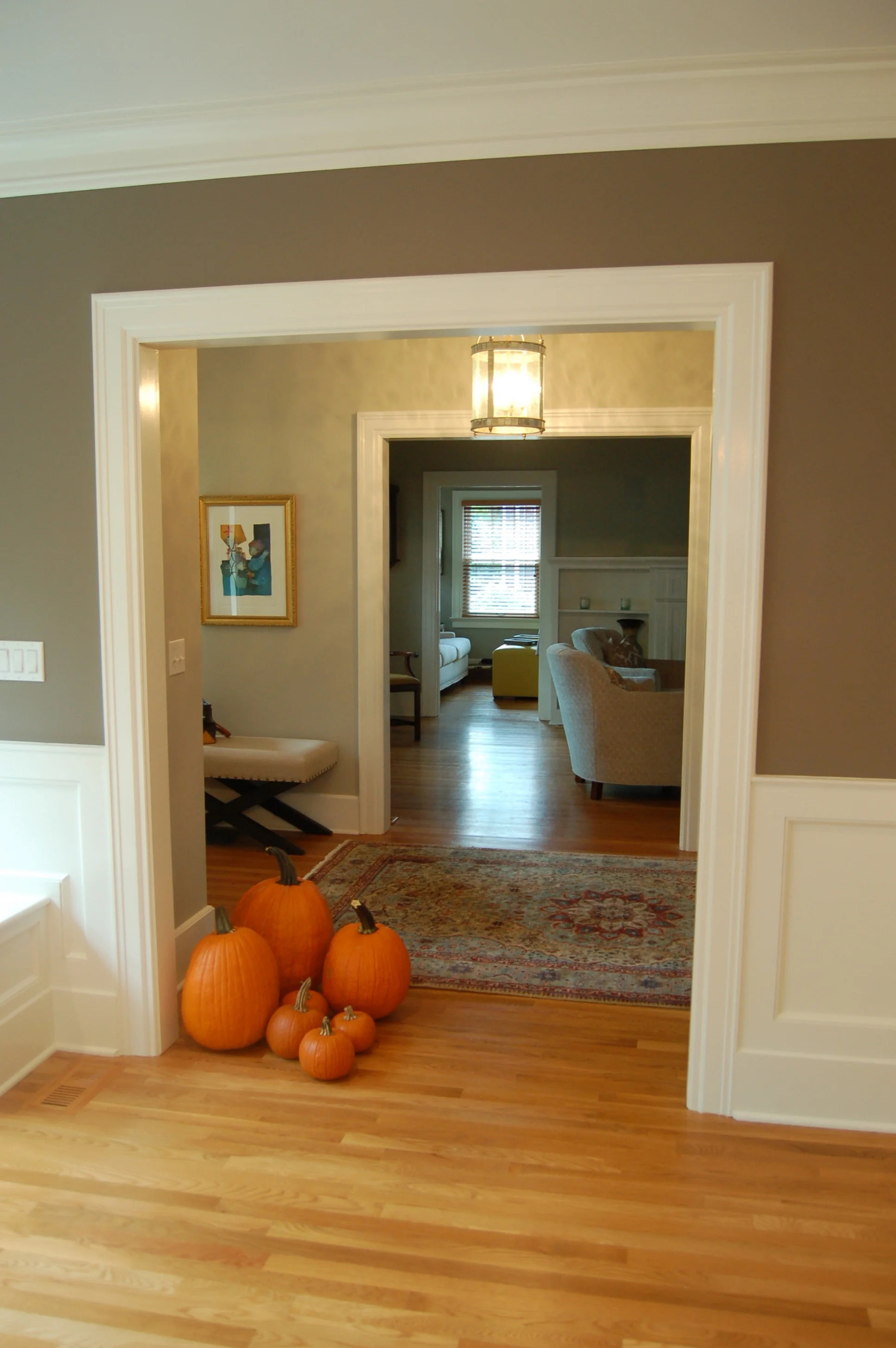
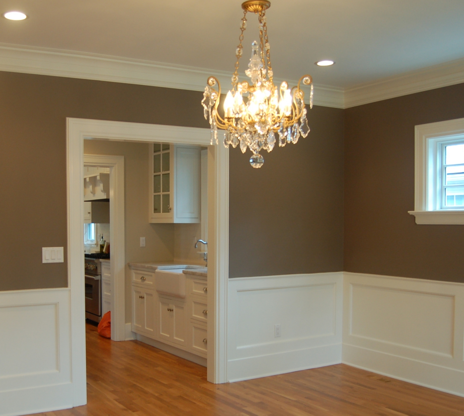
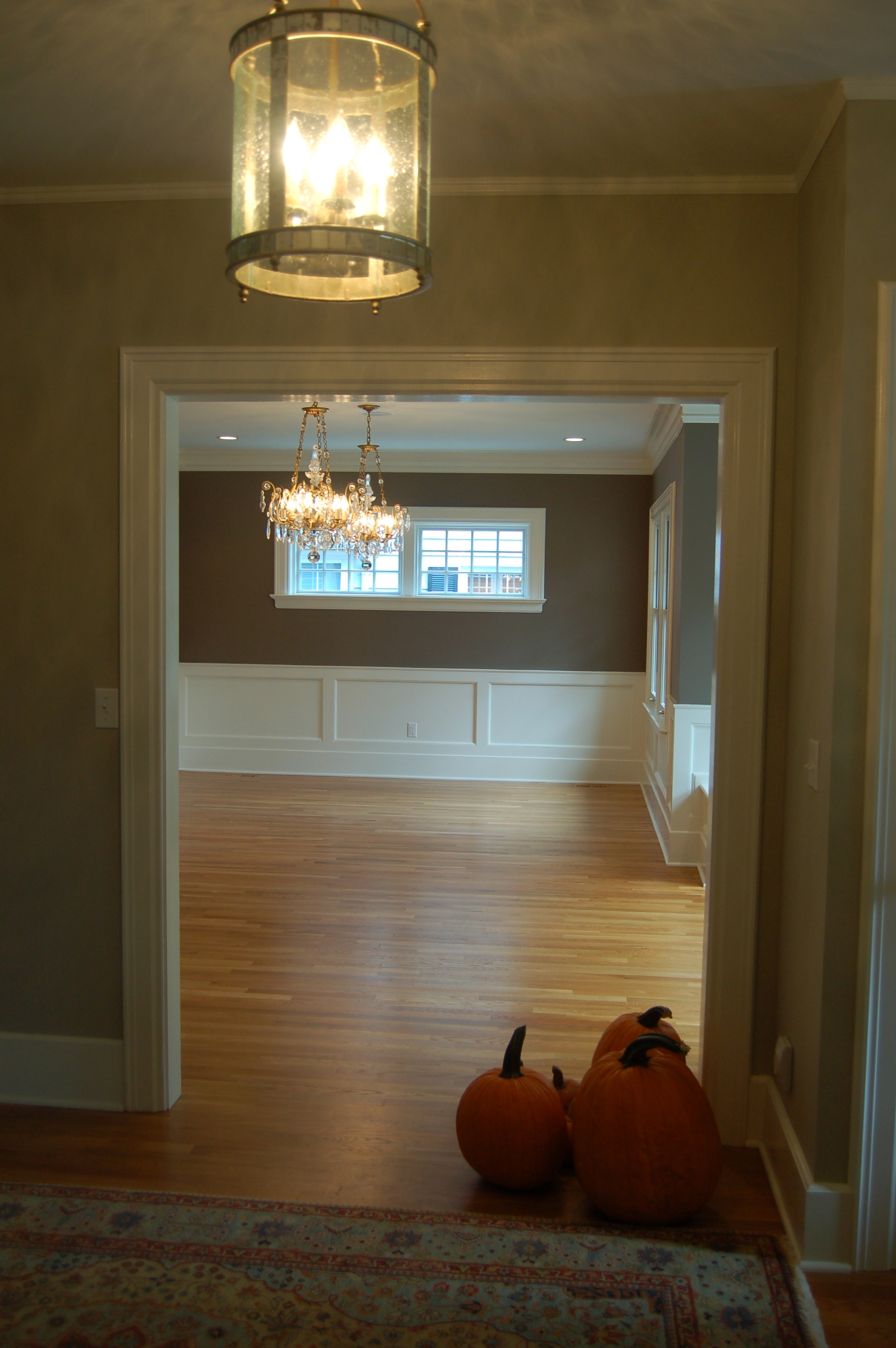
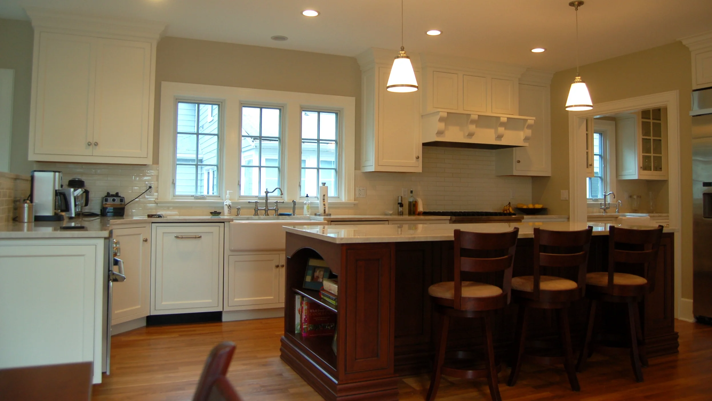
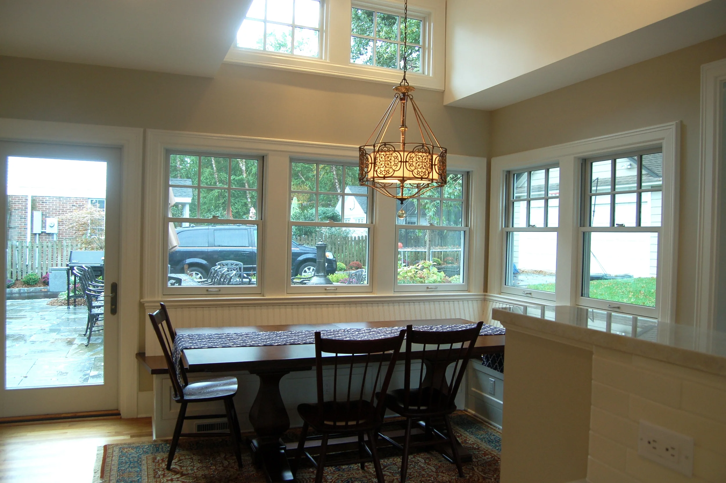
Before and after painted pictures of an expansion of ground floor and basement of this center hall colonial in Glen Ridge, New Jersey. Client asked for calming neutrals. I love Benjamin Moore Revere Pewter as a regal feel in grand hallways. Color Stories Porcini in Dining Room and Benjamin Moore Clay Beige in massive 1500 sq ft kitchen. Dining room table was last detail yet to install. Architect and Contractor: Sionas

Concept, color and decor for Lab Inc.— my design studio. Style was inspired by a 1960's science lab. Partnered with Victoria Kirk, Interior Design and Architect, Mark Oller of MOVK. Photographer: Dorotheé Ahrens
